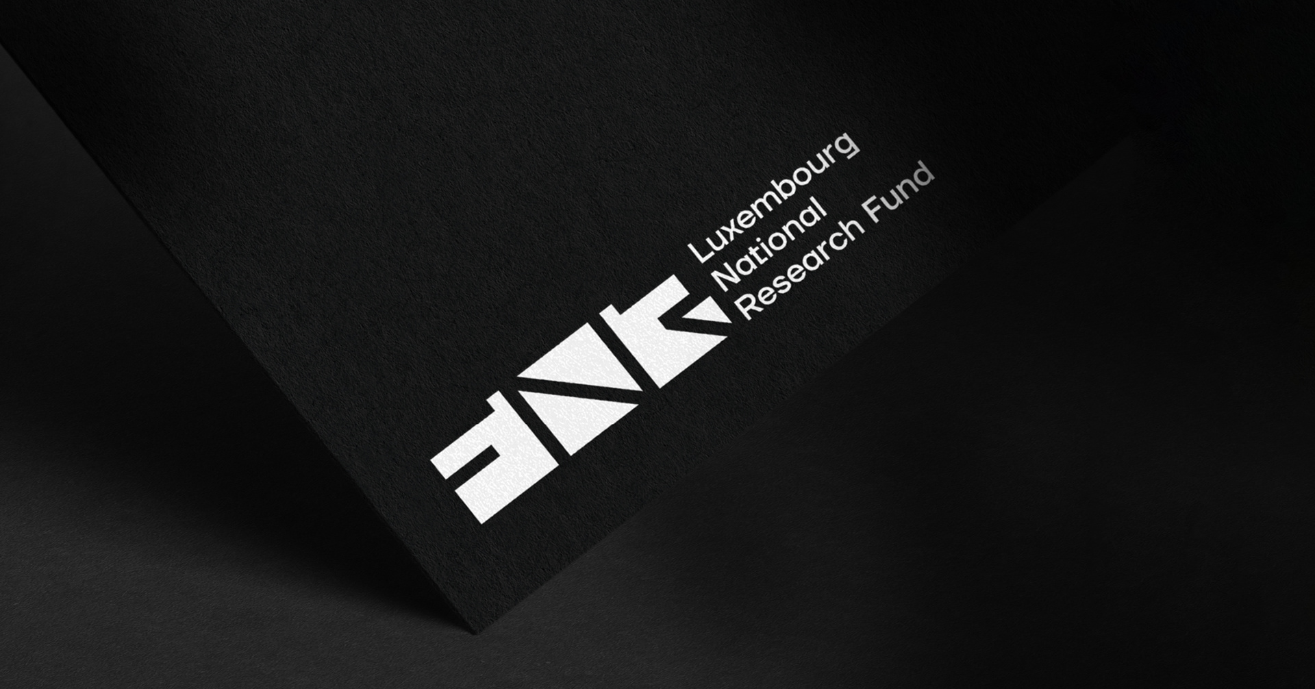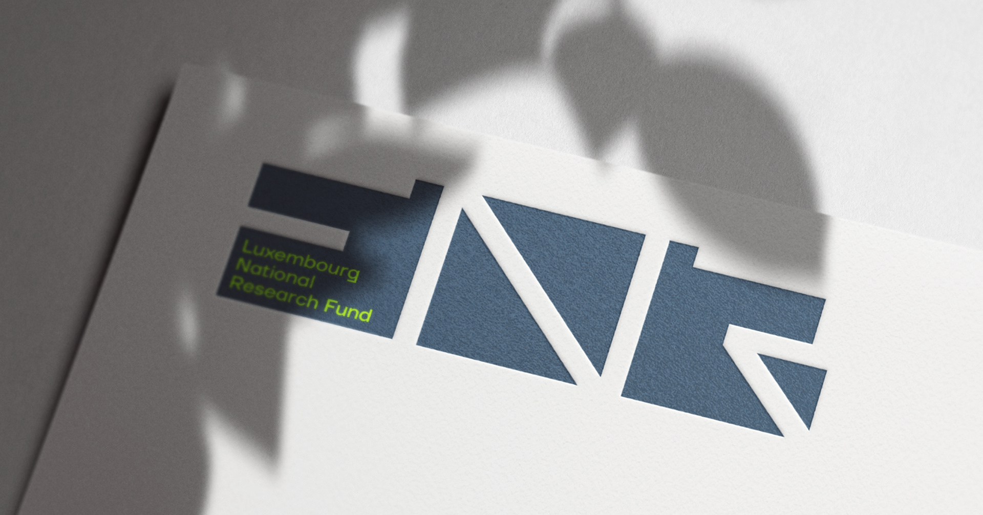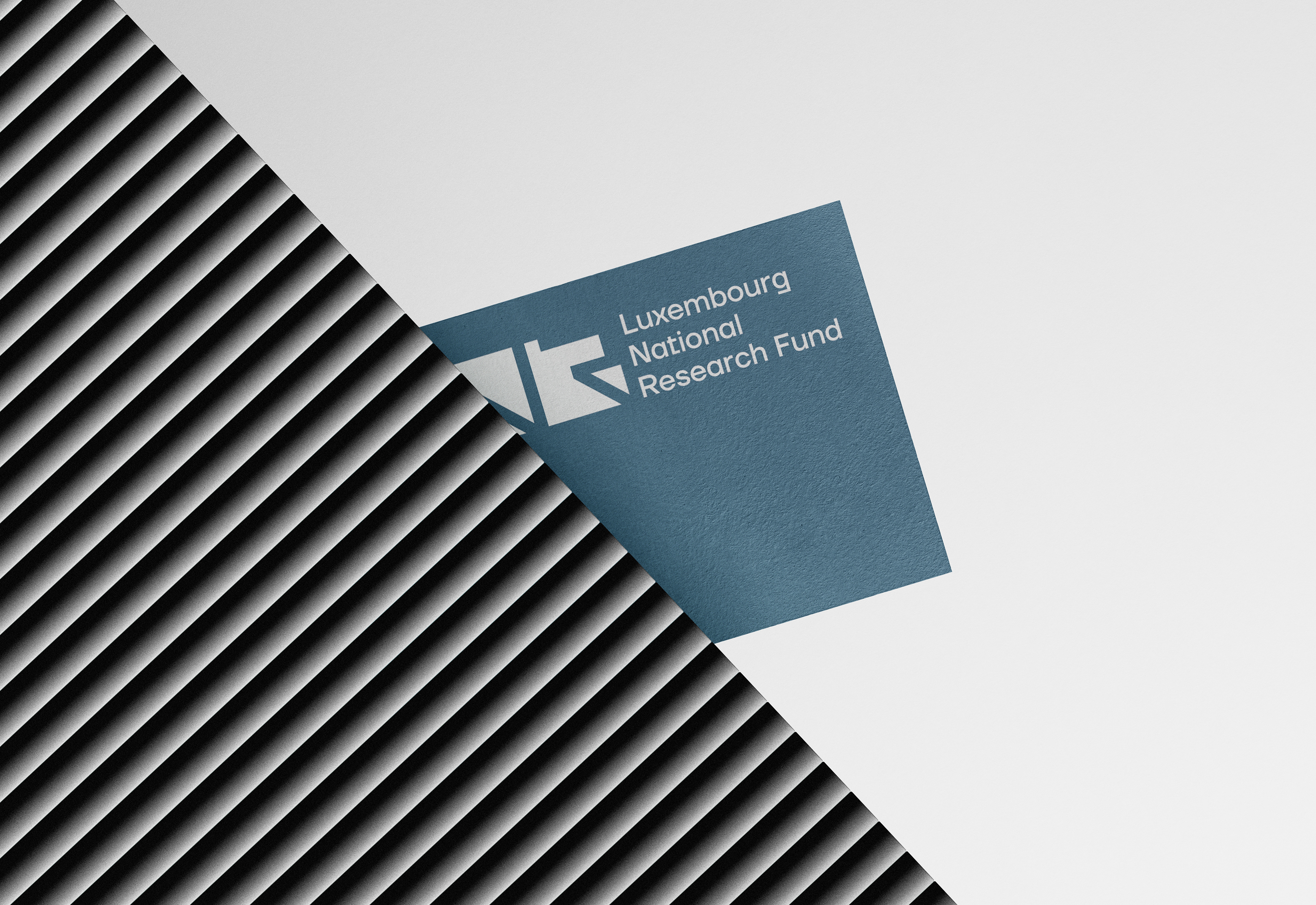

We worked on a complete redesign for the Luxembourg National Research Fund (FNR), by choosing a bold and dynamic way, highlighting how the brand is using its acronym.
Client
Luxembourg National Research Fund (FNR)
Luxembourg National Research Fund (FNR)
Services
Branding
Branding
Industry
Research
Research
Year
2023
2023
Motion:
Brussobaum
Brussobaum
Website:
lola
lola
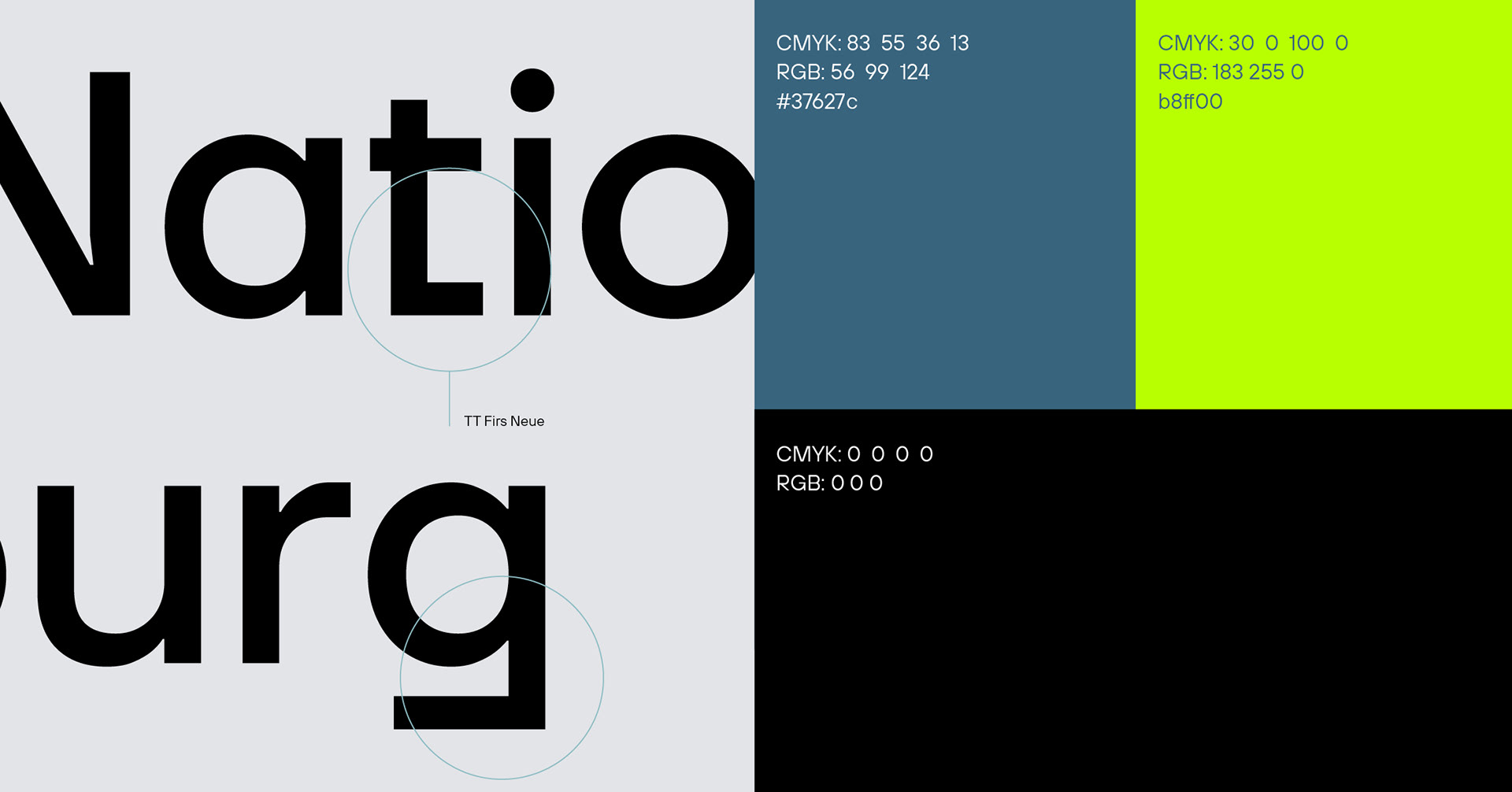
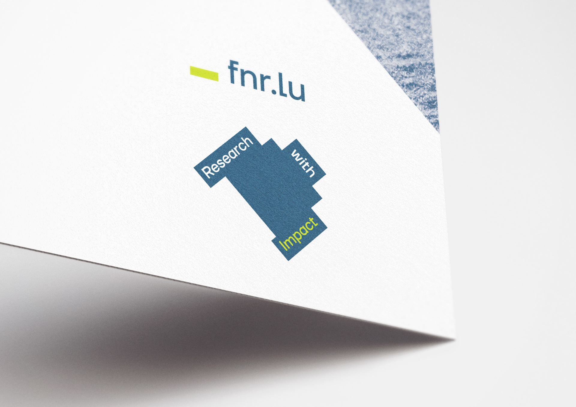
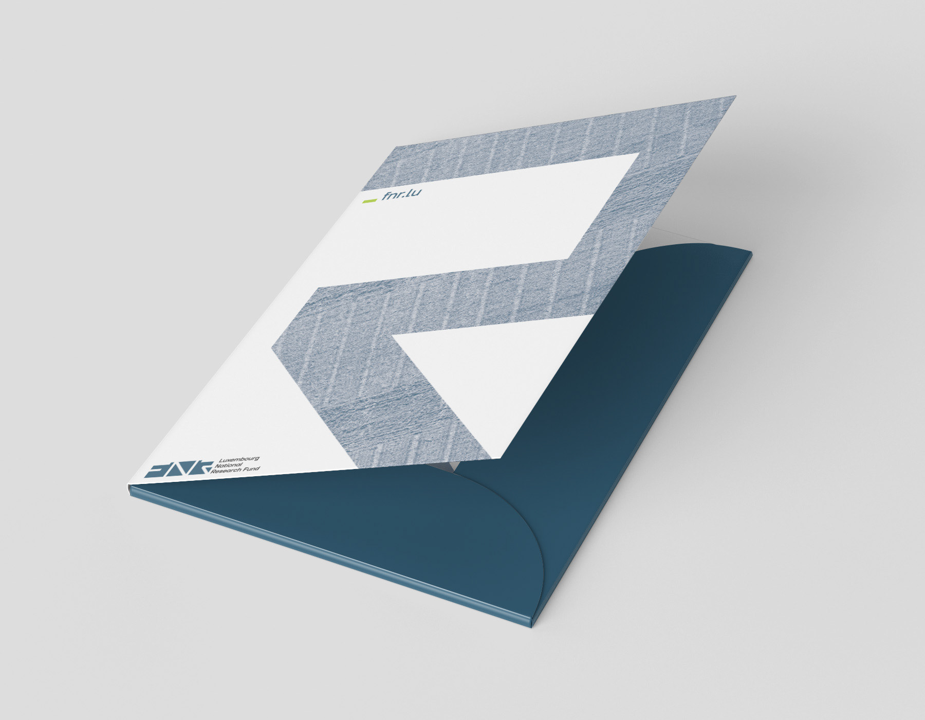
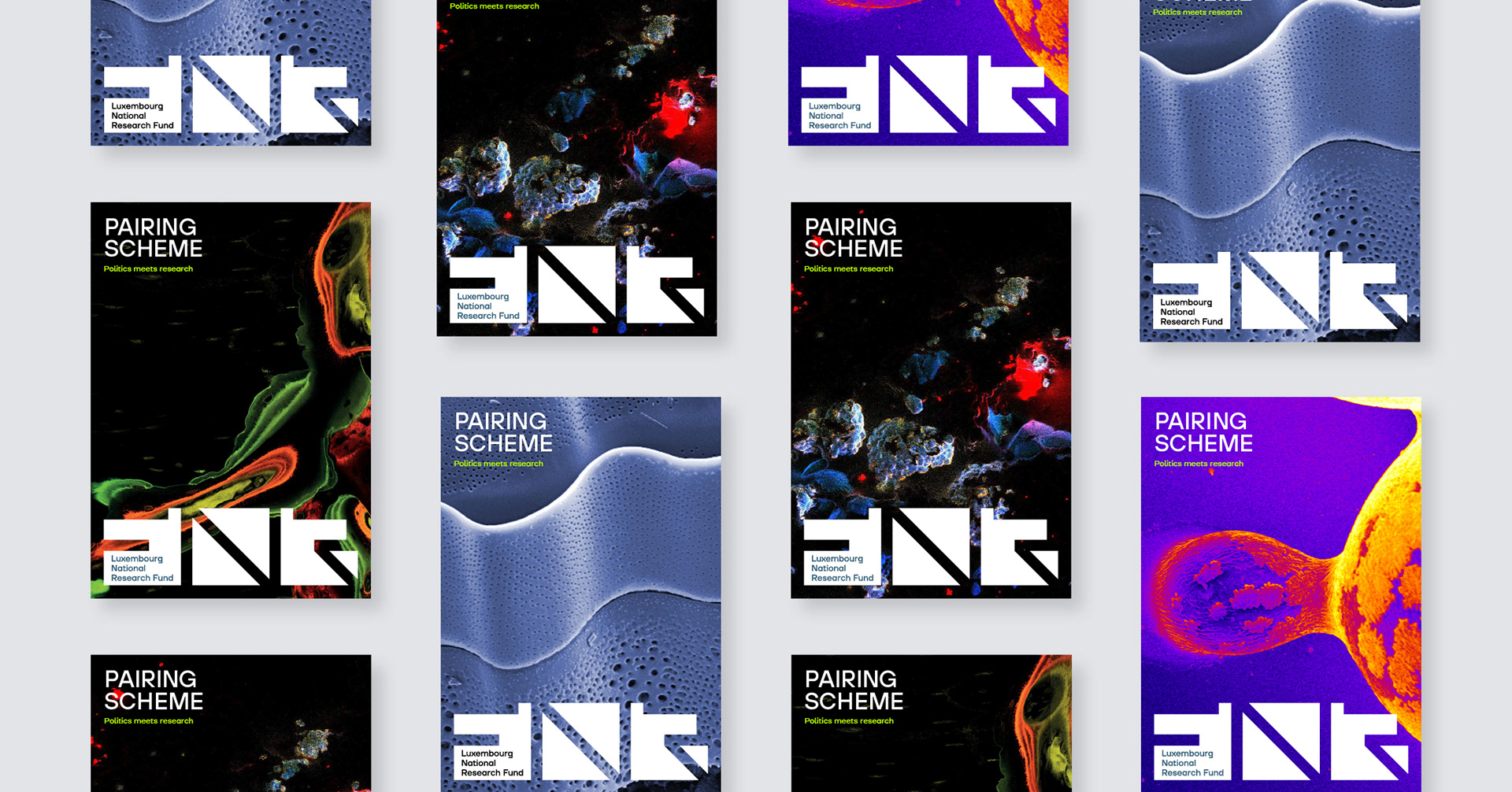
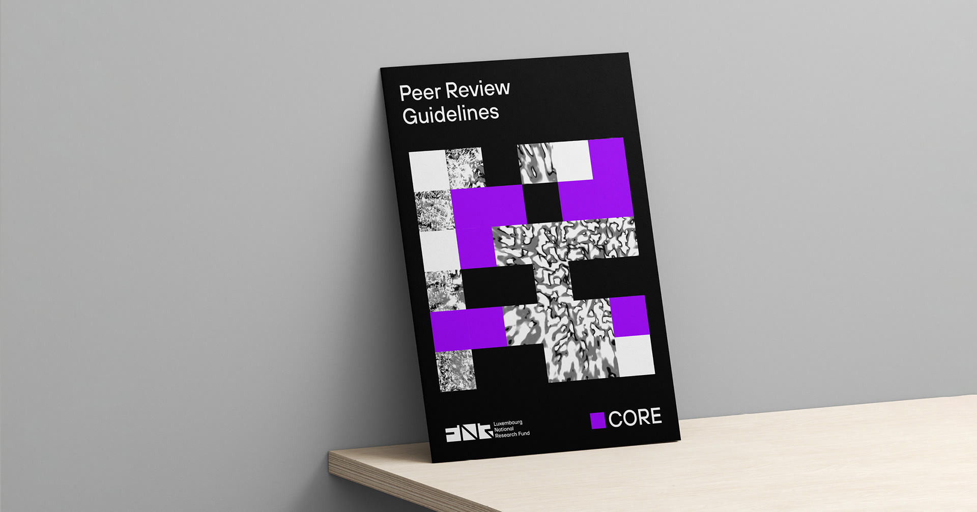
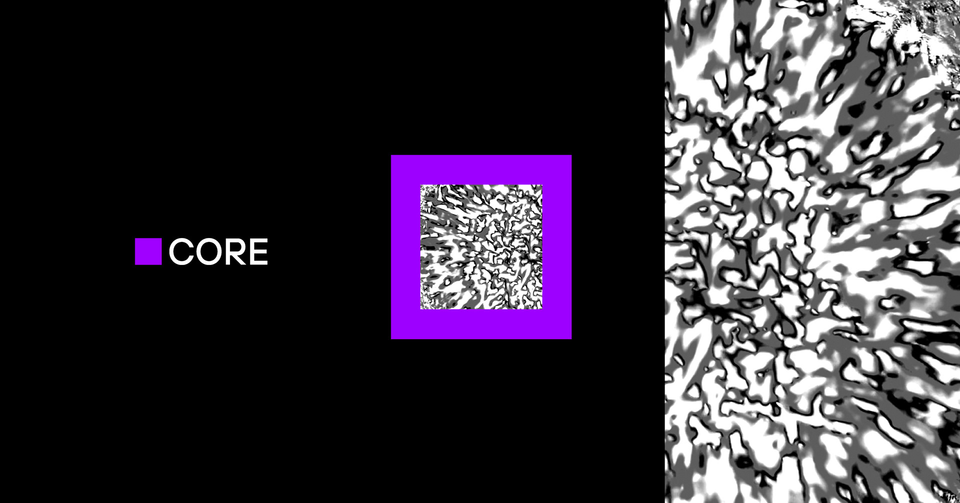
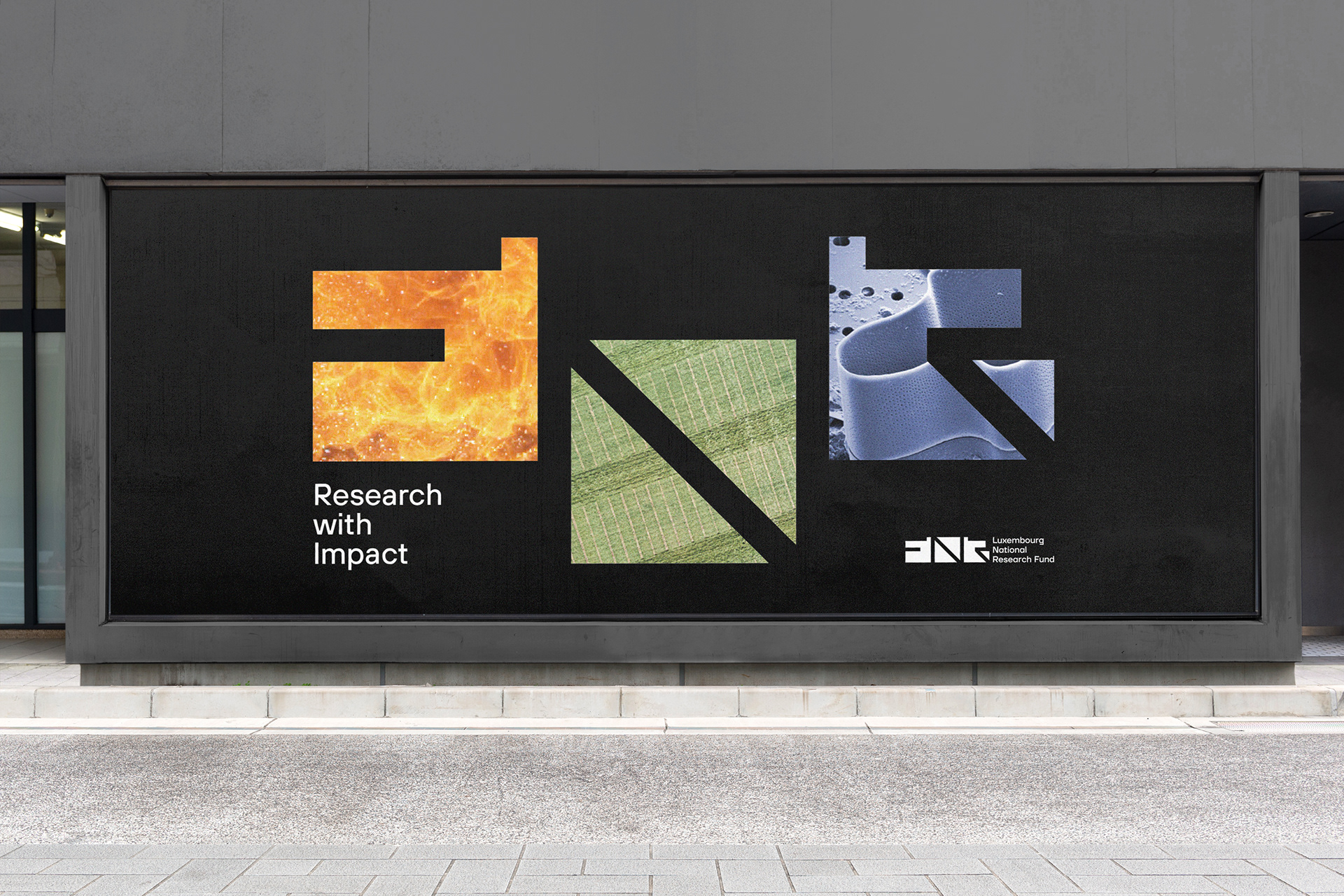
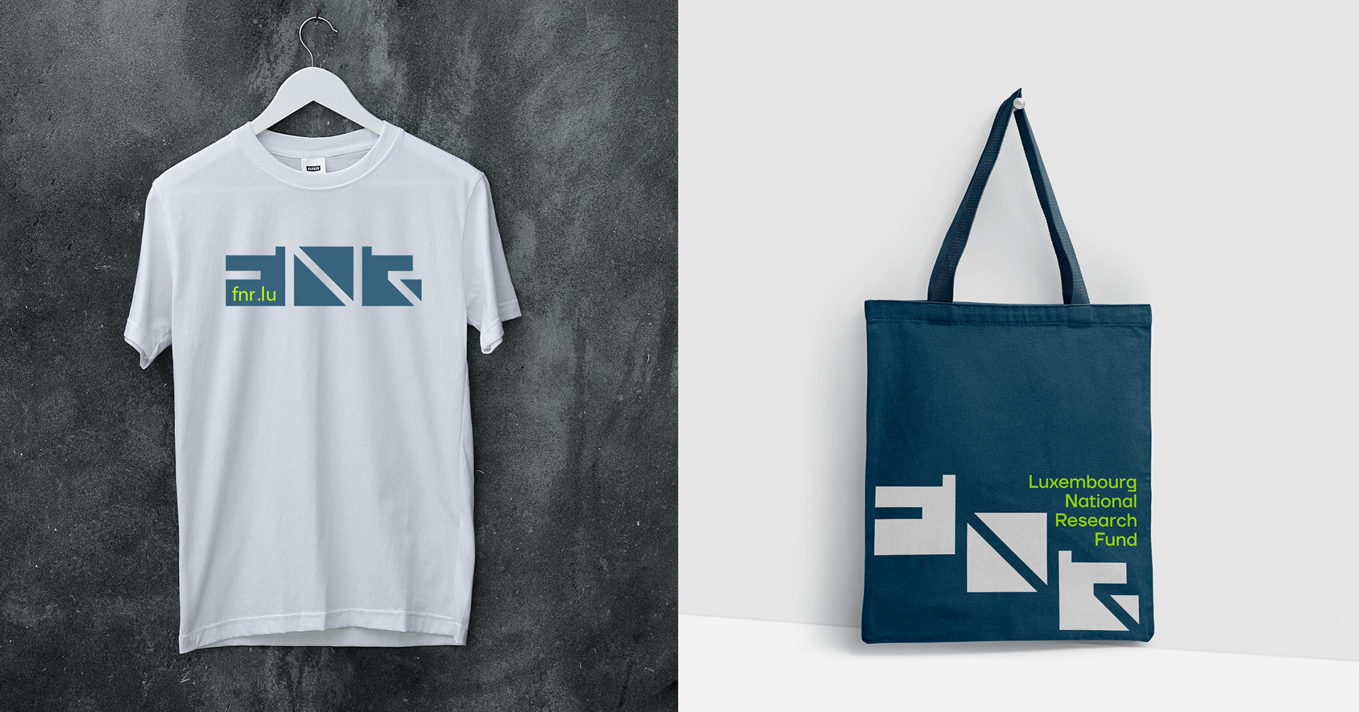
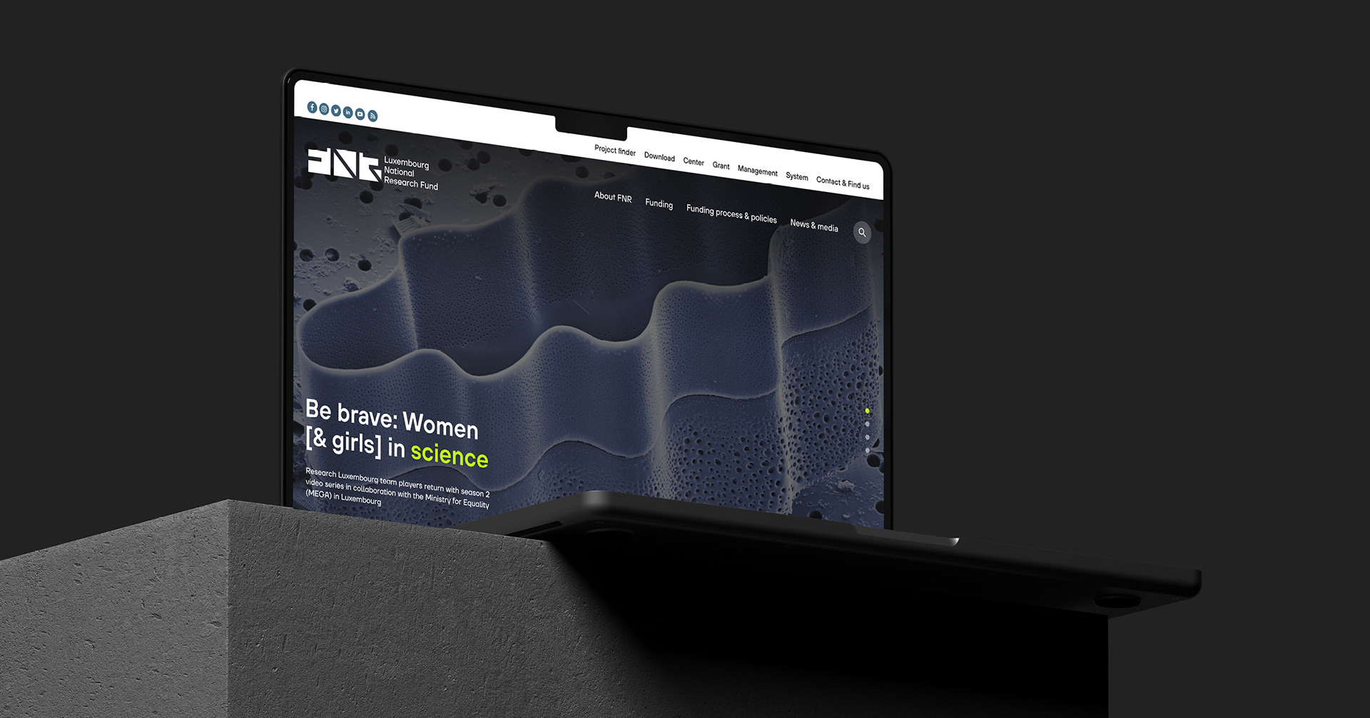
As the FNR’s presence in the Grand Duchy is well established, the redesign is an evolution of the previous one. Using the negative spaces to symbolise the openness of science to the outside world. We designed the letters F, N and R in the logo and structured the entire identity around these shapes to create elements that could be infinitely adaptable. The use of Science pictures, showing the Research in Luxembourg, was as well a very important change in the design language. It also offers greater brand recognition, versatility, inclusivity, innovation and impact.